|
This is one of a few portraits that I had attempted to draw by eyesight alone. For most drawings, I often take a picture to use as reference. I feel I have developed my ability to draw from eyesight as well as my use of colored pencils over the course of my studies. Along with a gel pen, I had not used colored pencils very much in the past. One challenge I faced was that I encountered a point in my piece where the highlights were not bright enough, I was encouraged to use a gel pen which worked quite well. I also learned a lot about blending/shading prismacolor to achieve different levels of value. I was able to create depth in the folds using deeper shades of purple or blues, and shadows with darker greens. Since I usually prefer the simplicity of regular pencils, blending colors and creating different shades of color was a relatively new concept to me. Although I have come a long way, there is still plenty of room to grow where my skills with colored pencil are concerned. I took a risk with trying to add a shadow that was not accurate to the positioning of the object. Because the reference picture was taken horizontally rather than vertically as the picture was drawn, I had to freehand a shadow for looking slightly down on the object. This added a more realistic effect than I had anticipated. Some individuals even claimed that I had somehow "cheated" in making my drawing.
0 Comments
I drew these eggs freehand. No pictures, no objects, just what I thought an egg should look like. That being said, I was very satisfied with the shape of the three upright eggs. The crooked egg was really just a warm-up. As I went along, my shading became progressively better, and the eggs began to look more dimensional. Although the shapes could definitely be refined, I am glad with how these came out. 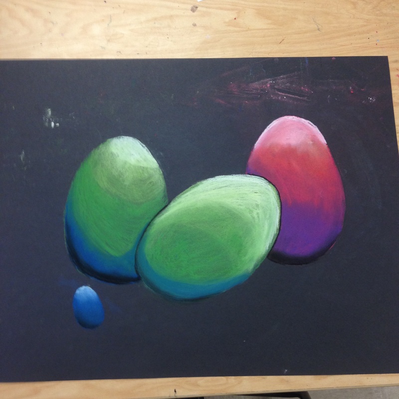 I took a different route than I usually do with this bottle, and I'm happy with the results. Normally when I dare things I use a photograph, but this time I just drew what was in front of me. I actually had fun playing around with different blues and greens to match the shades in the glass. The initial shape was the trickiest part. But once I got the lines and hi lights figured out, it was a no-brainer. What really brought the piece together was the background. McKayla had set the bottle on a pink sheet of construction paper. I didn't have any pink, so I used orange. The way the background reflects off the inside of the glass really helps the observer visualize and understand the contours of the bottle, as well as adds to a more life-like quality. 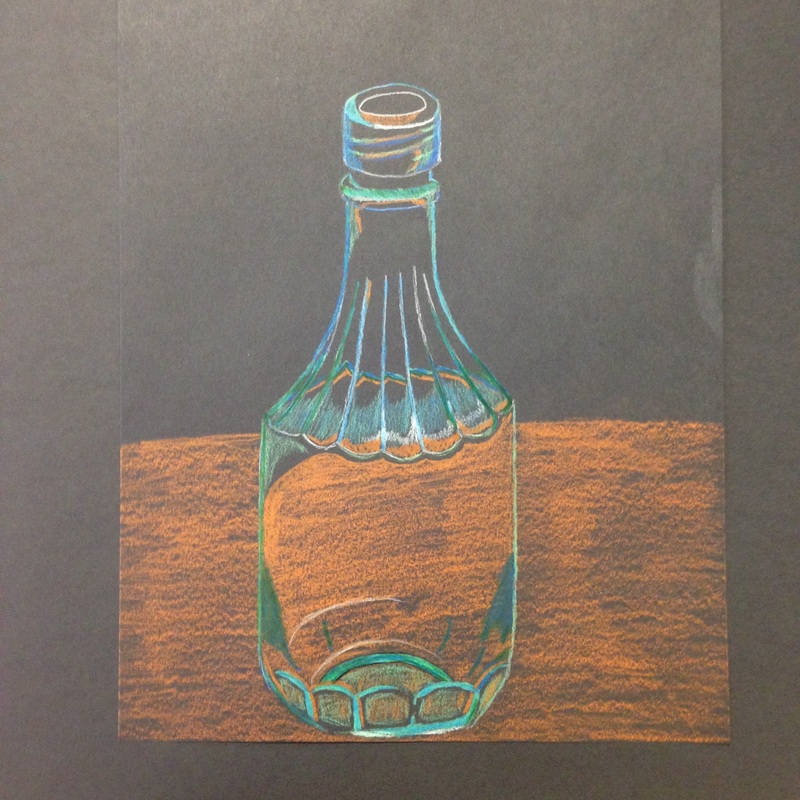 |
why?I'm learning how to draw for college. Archives
May 2015
Categories |
 RSS Feed
