|
scratchboard is a medium I have never used before, and to say the least it is quite bothersome. using a scratchboard is like using a permanent marker in reverse, and creating areas of darkness is especially challenging to do without creating a blatant black spot on your piece.Learning to scratch is also a challenge because scratching is a lot different than the smooth strokes of a pencil or pen. I will say however that scratchboards are fantastic for drawing texture such as fur...that is, if you are careful. I got the technique down after a while and I'm quite pleased by my last drawing. i used the 2/3 composition thing because it is more appealing to the eye, also i didn't have that much to draw. i am pleased that i was able to illustrate the bichromacy of my dog's fur 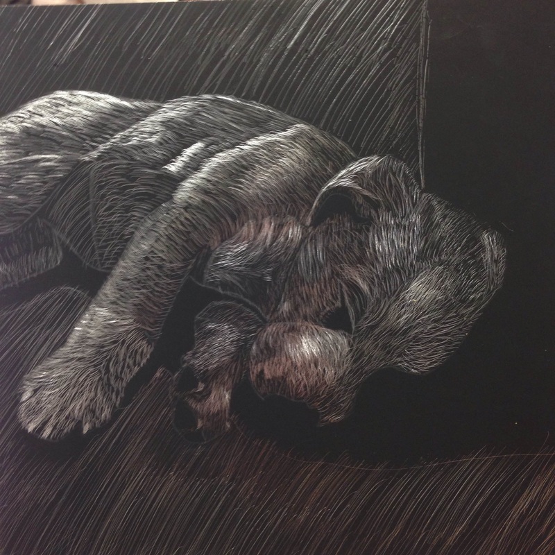
0 Comments
An important part of why I am taking this class is to develop my art/drawing skills. With this piece, I feel that I was really able to hone in my skills with shading and adding depth with contours. When I started drawing, I was afraid I would make the shadows too big and the surrounding areas too dark. After a while I became much more comfortable with my values and adding darkness to contrast highlights. I collaborated with my colleague, McKayla, who really encouraged me to push my line values and shading. Just as well, she encouraged me to think outside the box with the content of my drawing because all of my other ideas were "too cliche". She explained to me that every other student in the class was drawing a portrait of them ripping the skin off their faces. At the time I had thought this was a pretty creative idea. She was actually the one whose fist was used in the reference photo One obstacle I faced along the way was drawing eyes. I had always found drawing eyes to be tedious. Just as well, people have a tendency to focus too heavily on the eyes, making them seem like a drawing of their own or even being too big. I took a risk by doing a portrait where I had my eyes closed. It made the piece easier to draw without taking away from the overall content. 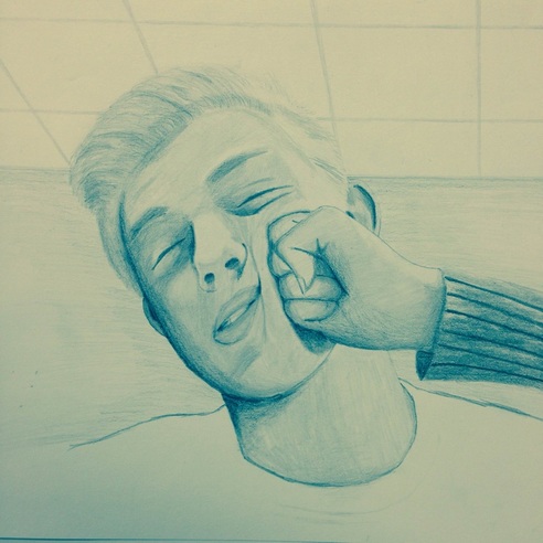 I was really glad with how this one came out. Normally when i draw from a picture i get caught up in the details and their location and my piece doesn't end up looking very life-like. but this time it did, especially around the rim of the jar. the problem with drawing from a photo reference is that sometimes the background looses context. when the object is affected by the background, like a jar, it is important to have context to explain what is going on and why the colors are where they are. looking at it now, I could have added more hi lights to the edges of the jar, also i could have added some more detail to the background. I did get the colors right and the locations of the hi lights appear to be accurate. 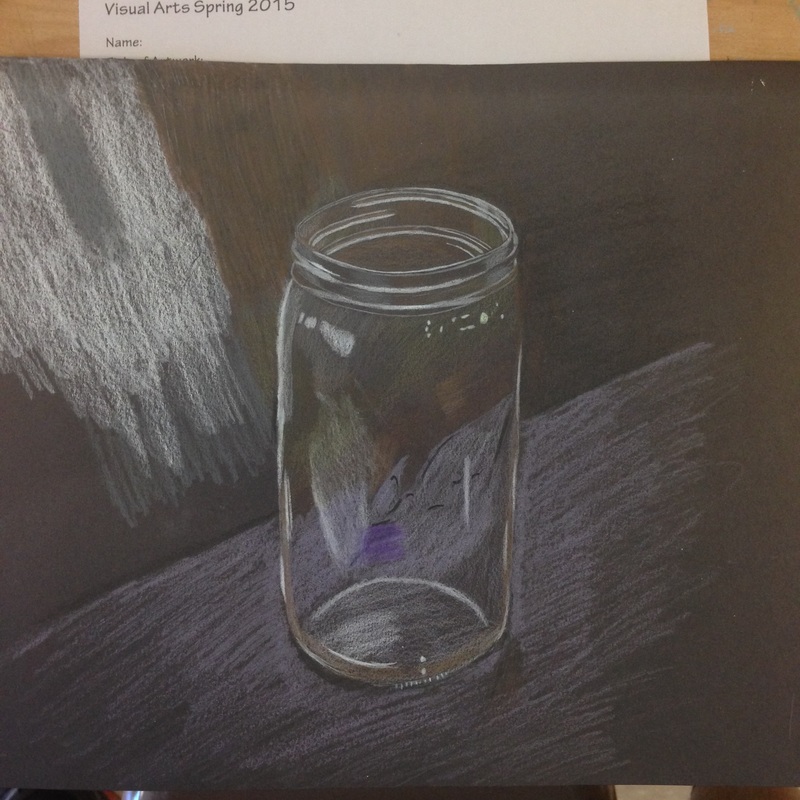 |
why?I'm learning how to draw for college. Archives
May 2015
Categories |
 RSS Feed
